

Bankrate credit card page engagement
Improved Bankrate’s credit card page experience through clearer structure and new components, increasing engagement and lifting click-through rates by 20%.
Role
Associate Product Designer
Skillset
Figma, Product Strategy
Team
2 Designers, 2 PMs
Timeline
2024-2025, 13 months
Jump to solution
OVERVIEW
Bankrate’s credit card category pages are seeing a significant decline in engagement. Our team wanted to diagnose the issue and deliver a solution that would help engage more users while still keeping the focus on the largely transactional nature of the page.
problem framing
Credit card category pages are losing engagement
Bankrate’s credit card category pages significantly decline in engagement past the 5th featured credit card in the form of click through rate (CTR) and conversion rate (CR).
While it’s normal to assume that the amount of users that view each product further down the page may decrease, there is something that is causing a drop in viewers and massive drop off in conversion rate (~88%) past the 5th featured credit card.

product analysis
Understanding what our users actually want
Revisiting our credit card category pages and combing over user research regarding credit card users’ intents revealed 2 main insights:
1
Users always want to see the most relevant and personalized information to their own situation.
2
Users are arriving on credit card category pages with many different intents.
diagnosis
What is broken about the current experience?
The credit card category page is optimized almost entirely around featuring cards and their benefits.
While this works for users who know exactly what they want, it falls short for those who arrive with different intents—such as learning how to use a card in a specific category or deciding which card is right for them.
After the first few top-ranked cards, additional cards provide diminishing value, making it harder for users to confidently choose or move forward.


Cards 1-5
Highly relevant results
Users are generally looking for these results.
Limited-time offers
High-scoring reviews
Great benefits
Cards 6 & 7
Slightly relevant results
These results may be relevant for niche audiences.
Niche callouts
Average reviews
Average benefits
Cards 8-14
Rarely relevant results
These results are likely irrelevant for most users.
Lower-scoring reviews
Below-average benefits
strategy exploration
Evaluating two strategic solutions
To address the key insights uncovered earlier and improve engagement on Bankrate’s credit card category pages, I explored two strategic approaches: each designed to support different user intents and business priorities.
1
Intent-led Approach
Focus primarily on addressing each user’s intent and triage their needs early on in the page.

2
Transactional Approach
Primarily target the users who are ready to convert by engaging them with content that will aid their decision-making process.

final solution
Prioritizing high-intent users
After reviewing both approaches with stakeholders, we chose to prioritize high-intent users in order to preserve the transactional nature of the category page.
This direction focused on users who were either close to applying or seeking reassurance before committing, using targeted content and clearer comparisons to support faster, more confident decision-making.
Why not the intent-led approach?
The intent-led approach offered broader support for different user needs, but conflicted with the category page’s role as a transactional entry point.
Prioritizing early intent identification required significant space above the fold, potentially distracting from high-intent users and weakening conversion performance.
1.
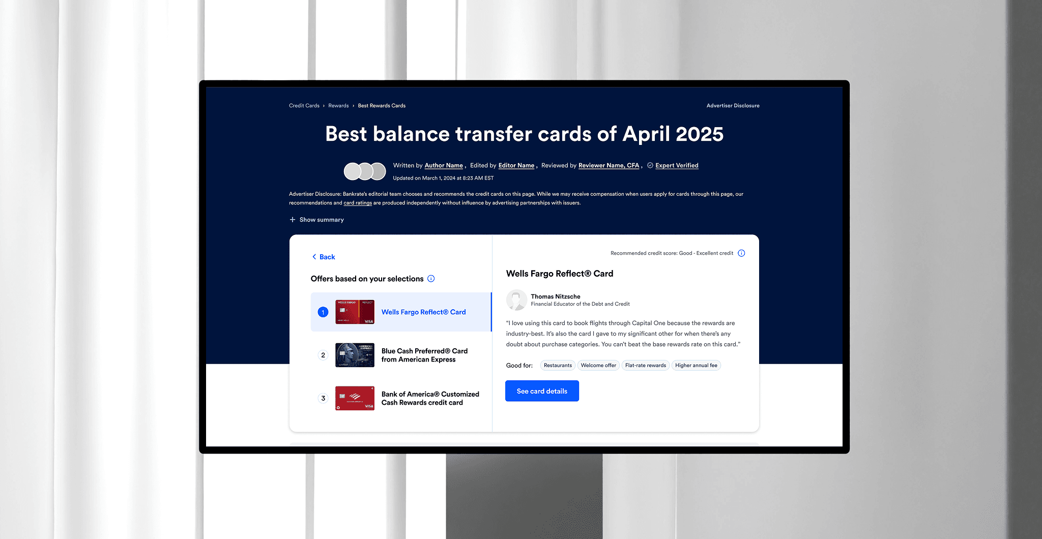
Prioritizing high-intent users with CardMatch
I introduced a CardMatch recommendation flow at the fold to immediately support high-intent users who were ready to act, while still offering clear guidance for those who needed reassurance before applying.
2.
Reducing low-value results in ranked lists
Research showed that cards ranked beyond the top five provided diminishing value and were a common drop-off point. I hid these lower-impact results by default, while still allowing users to reveal them if they wanted to explore further.
3.
Supporting decision-making beyond rankings
Beyond the top-ranked cards, the original page offered little support for users still deciding.
I introduced decision-supporting content earlier in the experience by adding in existing tools, data, and trust-signaling, like the balance transfer calculator and cards most popular with users, so users could answer key questions, build confidence, and continue toward conversion without leaving the page.
outcome
20% increase in click-through rate
Of the changes that we tested on the new balance transfer category page, there was about a 20% increase in click-through rate as well as a higher revenue-per-session.
Check out the live site
reflection
Next steps
Since we only launched the new page with some of the new features, the next step would be to incorporate more of the updates like automatically hiding cards or pulling in more relevant content below the featured cards and see how that would impact the existing site.
Bankrate credit card page engagement
Improved Bankrate’s credit card page experience through clearer structure and new components, increasing engagement and lifting click-through rates by 20%.
Role
Associate Product Designer
Skillset
Figma, Product Strategy
Team
2 Designers, 2 PMs
Timeline
2024-2025, 13 months
Overview
Bankrate’s credit card category pages are seeing a significant decline in engagement. Our team wanted to diagnose the issue and deliver a solution that would help engage more users while still keeping the focus on the largely transactional nature of the page.
Problem Framing
Credit card category pages are losing engagement
Bankrate’s credit card category pages significantly decline in engagement past the 5th featured credit card in the form of click through rate (CTR) and conversion rate (CR).
While it’s normal to assume that the amount of users that view each product further down the page may decrease, there is something that is causing a drop in viewers and massive drop off in conversion rate (~88%) past the 5th featured credit card.
Product Analysis
Understanding what our users actually want
Revisiting our credit card category pages and combing over user research regarding credit card users’ intents revealed 2 main insights:
1
Users always want to see the most relevant and personalized information to their own situation.
2
Users are arriving on credit card category pages with many different intents.
Diagnosis
What is broken about the current experience?
The credit card category page is optimized almost entirely around featuring cards and their benefits.
While this works for users who know exactly what they want, it falls short for those who arrive with different intents—such as learning how to use a card in a specific category or deciding which card is right for them.
After the first few top-ranked cards, additional cards provide diminishing value, making it harder for users to confidently choose or move forward.
Cards 6 & 7
Slightly relevant results
These results may be relevant for niche audiences.
Niche callouts
Average reviews
Average benefits
Cards 8-14
Rarely relevant results
These results may be relevant for niche audiences.
Lower-scoring reviews
Below-average benefits
Cards 1-5
Highly relevant results
Users are generally looking for these results.
Limited-time offers
High-scoring reviews
Great benefits


Strategy Exploration
Evaluating two strategic solutions
To address the key insights uncovered earlier and improve engagement on Bankrate’s credit card category pages, I explored two strategic approaches: each designed to support different user intents and business priorities.
1
Intent-led Approach
Focus primarily on addressing each user’s intent and triage their needs early on in the page.
2
Transactional Approach
Primarily target the users who are ready to convert by engaging them with content that will aid their decision-making process.
Final Solution
Prioritizing high-intent users
After reviewing both approaches with stakeholders, we chose to prioritize high-intent users in order to preserve the transactional nature of the category page.
This direction focused on users who were either close to applying or seeking reassurance before committing, using targeted content and clearer comparisons to support faster, more confident decision-making.
Why not the intent-led approach?
The intent-led approach offered broader support for different user needs, but conflicted with the category page’s role as a transactional entry point.
Prioritizing early intent identification required significant space above the fold, potentially distracting from high-intent users and weakening conversion performance.
1.
Prioritizing high-intent users with CardMatch
I introduced a CardMatch recommendation flow at the fold to immediately support high-intent users who were ready to act, while still offering clear guidance for those who needed reassurance before applying.
2.
Reducing low-value results in ranked lists
Research showed that cards ranked beyond the top five provided diminishing value and were a common drop-off point. I hid these lower-impact results by default, while still allowing users to reveal them if they wanted to explore further.
3.
Supporting decision-making beyond rankings
Beyond the top-ranked cards, the original page offered little support for users still deciding.
I introduced decision-supporting content earlier in the experience by adding in existing tools, data, and trust-signaling, like the balance transfer calculator and cards most popular with users, so users could answer key questions, build confidence, and continue toward conversion without leaving the page.
Outcome
20% increase in click-through rate
Of the changes that we tested on the new balance transfer category page, there was about a 20% increase in click-through rate as well as a higher revenue-per-session.
Check out the live site
Reflection
Next steps
Since we only launched the new page with some of the new features, the next step would be to incorporate more of the updates like automatically hiding cards or pulling in more relevant content below the featured cards and see how that would impact the existing site.
Next project